Showing posts with label fine art printing. Show all posts

Dec 5, 2022

ART SHARING: BLACK & WHITE FINE ART PHOTO

BLACK & WHITE FINE ART PHOTO

Professional Satin Photo Paper, image size 27×18″

Photo by Alexander Chan

Turn your digital image into fine art masterpiece with Trail Studio’s exceptional quality printing & framing Service. 

Nov 12, 2021

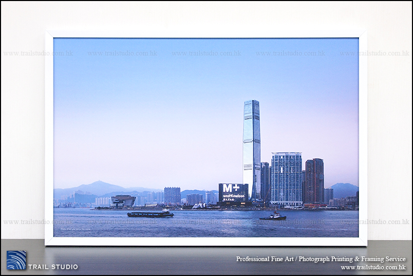
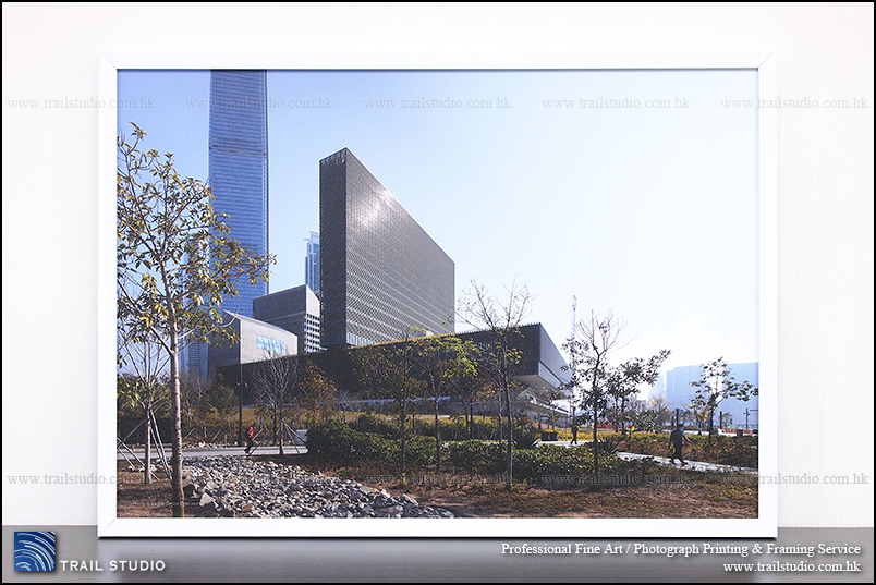
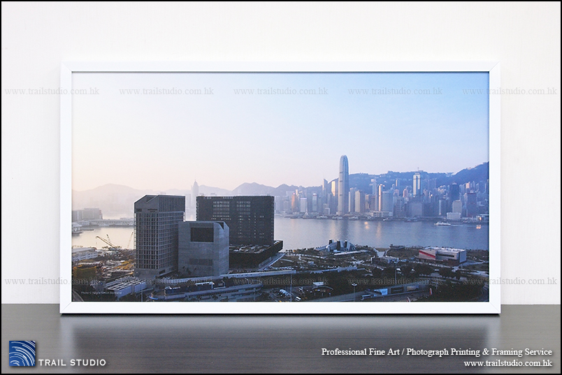
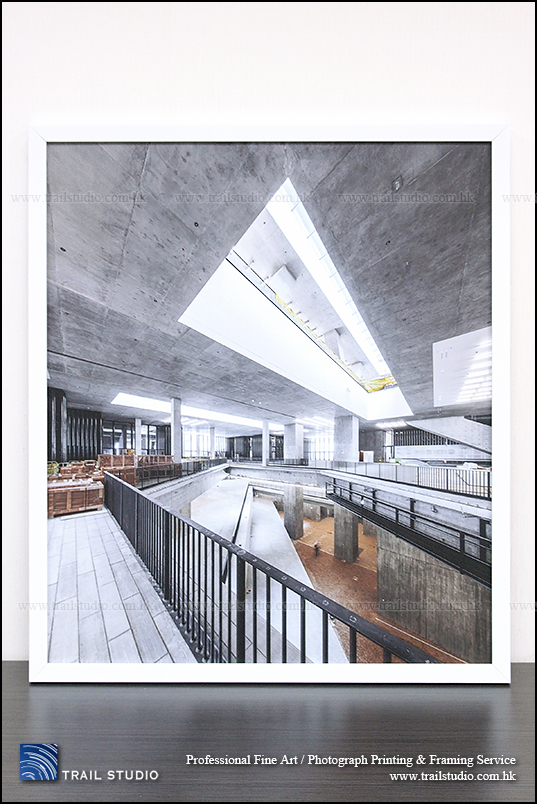
西九文化區視覺文化博物館M+開幕!

West Kowloon Cultural District M+ Museum
Professional Photo Printing by Trail Studio for M+

(以上是我們替M+視覺文化博物館製作的一批辦公室裝潢相片的一小部分)

西九文化區視覺文化博物館M+開幕!

阿Ming從小喜歡攝影藝術,這也是後來修讀理工大學設計學系的主因之一。一直覺得只在monitor打開看兩眼的相片檔案,算不上是藝術作品,習慣把特別喜歡的相片印出來,但深感在香港極難找到效果好的攝影輸出公司,而於10年前成立Trail Studio(並從此快樂地公器私用)。

當年剛好公佈西九龍將會有一間全新的藝術館,作為設計/藝術業的一份子,滿心期待著香港的設計/藝術業將會以此為契機大有可為,也間中留意M+有沒有甚麼活動以個人身份參與,例如這個:

https://www.neonsigns.hk/neon/?i=53991aef3b9d5&lang=en

然後博物館大樓動工,他們間中需要準確、高精度的工程進度相片時,找上了Trail Studio印製。

因工作關係而略略看到工程的進度,又從新聞看到工程經歷風風雨雨,大樓終於落成,他們需要一些較大張的掛牆相片作為內部辦公室裝潢時,也找上了我們。

我們在博物館沒有人脈關係 –– 公營機構做事依循規費程序,自然不看人脈關係。據知當初他們找我們印製工程進度相片,是因為找尋不同公司時發現到我們是做事認真、品質優良、可靠的一間。

及後找我們製作辦公室裝潢的另一組人員,並不是從第一組人員中得悉我們的,而是在獨立找尋能承辦商時,同樣地看中我們是做事認真、品質優良可靠的公司。

這兩組人員並沒有互相交流,他們都是各自以品質、可靠度為準則找上我們,相信我們接連兩次都是憑實事求是的精神、不吹噓地製作真實的高品質相片,而得到這個香港首屈一指的藝術機構認可吧。

成立Trail Studio的10年過去了,相片、藝術作品印刷行業依舊以吹噓為主流(例如使用印廣告banner的廉價技術印製油畫相,然後安個很high的「歐洲油畫相」名堂)。

廉價製作明明一看便可以感覺到畫質出事,常常糟塌了好的作品,但又真的竟有不少人感覺不到問題而相信那些真的是頂級製作。這或許是主流環境及文化的問題: 香港生活節奏快、空間細、速食文化強,人們稍欠了打從心底而發的藝術氛圍,自然缺了分辨能力,於是吹噓便奏效。雖覺「文化沙漠」說得太誇張,「藝術沙漠」倒認同。空間問題嘛,即時又想到當年設計系的老師Kacey Wong 展出於M+的藝術裝置「飄流家室」:
https://www.mplus.org.hk/tc/collection/objects/paddling-home-2019314/

如果人人住在這樣的「納米無明火」(佩服替這個Viu節目改名的人,非常精景),自然是沒有牆壁去掛大相了,也沒有閒情去認識何謂藝術、品質了。

常收到不少連丁點看網頁的時間也不肯花,便直接致電的查詢,問是不是像別家一樣製作「歐洲油畫相」、「韓式油畫相 」、別家用「頂級油畫布」仍比我們便宜,不減價不給生意等等。

面對奇怪的查詢實在啼笑皆非,這不是生意的問題,而是有否尊重藝術工作者的問題。打個比喻就像挑機說米芝蓮食府的安格斯牛扒比老麥安格斯牛堡賣貴那麼多是搵笨;又像說花百多元便買到個99%高仿的A貨名牌包包,真貨賣得貴是搵笨。

我認為如果認真看待藝術,又或希望保障自己,自然會花點時間看看網頁了解相關資料,做了這步便自然能知道找的公司是否認真、可靠,這也是對藝術的認知、懂藝術的深度。這也是我們這麼一間小小但做事認真的公司常接到M+等不同的、懂藝術的厲害企業、人士的訂單的原因吧。

說回M+,能為其效勞實在感到非常榮幸、愉快,在工作過程中感受到他們對同樣身為藝術工作者的我們的專重。期望博物館的開幕可以改變香港的藝術氛圍。

西九文化區視覺文化博物館M+

地址:香港九龍西九文化區博物館道38號(地圖按此

開放日期:11月12日起,逢星期二至日

開放時間:10am-6pm(星期二至四、周末及公眾假期);10am-10pm(星期五)

入場費:首12個月可免費參觀M+展廳展覽(持有有效身份證明文件的香港居民)

相關新聞:

https://news.now.com/home/local/player?newsId=456432

Dec 19, 2020

給婚禮攝影師的經驗分享- 畫質優良的大相/油畫相對專業形象的重要性


與婚禮攝影師談論代客製作結婚油畫,間中會聽到一個論調:

「客戶不懂分辨品質好壞的,使用低成本的相片製品便能賺更多」

我們雖然同意每位攝影師/每間攝影公司都會有自己的特定經驗及客戶群,亦要計算成本,不過我們多年來除了會與不同類型的攝影師接觸外,亦會與需要印製大相/油畫相的客戶直接溝通,我們很輕易便能告訴你以上論調並非事實。

出於相同原因,我們亦發現很多數碼年代的婚禮攝影師,由於太習慣以檔案形式交相,對甚麼是及格/優質的相片製品、以及對印製相片的相關學問一無所知,導致客戶隨時比自己更懂分辨品質好壞,在這方面當然易「出事」。(如果不想這樣,可考慮看看我們BLOG或網頁的文章)

一些知名專業攝影師與我們合作的原因:
心態決定境界,盲目相信「客人不懂分辨好壞」只會換來「不懂分辨好壞的客人」。 (Self-fulfilling prophecy的好例子)

攝影行業競爭激烈,如果是以美感作賣點,想提高形象脫穎而出、接觸更多肯花費,懂得欣賞自己的客戶,品質優良的大相/油畫相是起到重要作用的一環,只是一些婚禮攝影師在完成工作後,未必會與客戶保持接觸而忽略了其重要性:

-攝影屬較為依靠朋輩推薦的行業,客戶擺放在家中當眼處,影像真實有質感的大相能充分展現攝影師功力,能吸引親友(即潛在客戶)的目光及話題;又由於能反映品味,言談間客戶會更主動推薦攝影師。客戶放在社交網頁的相片,數天後就會沉底失去朋輩宣傳效用;但當客戶常招呼朋友,家中一張品質優良久不褪色的大相,就是攝影師長久的金漆招牌。

-大相/油畫相製作一分錢一分貨,平價製品會大幅減低影像原有的層次感、藝術感、吸引力。有審美直覺、願意花費的潛在客戶在展覽會看到缺乏吸引力的大相,易認定攝影師功力不足而不會上前查詢,攝影師一開始便錯過優質客戶而不自知,剩下來的當然是「不懂分辨好壞的客人」,就很易面對一連串壓價、要求送贈品及優惠等情況。

-常有客戶與我們傾談時說以往製作大相曾經「中伏」。這類客戶不乏肯花費,有品味的家庭相客戶,不少都是抱怨之前結婚時的攝影套餐「送」的大相/油畫相很快褪色又或看上去「怪怪地」(平價製作失真度高所致)。攝影行業依賴口碑,只要其中一兩項配套令客人產生疑惑,隨時難令客戶放心推薦親友。我們亦發現如果客戶滿意結婚攝影師,日後再回頭拍攝家庭相的機會似乎出奇的高。

-以高質大相/油畫相作賣點之一,可更全面令客戶感受攝影師對藝術、細節的重視,提昇專業形象。而高低質大相的差價大約只是每次開工的來回的程士費,不需事前大量投資而是逐次付款,對於依靠口碑的行業來說是低風險而且易有回報的投資 。

最後一提,我們亦常遇到結婚油畫客戶埋怨攝影師在大日子前不到兩三星期才交pre-wedding photo(公道說我們不清楚是否客戶本身booking太趕),導致他們在關鍵時刻壓力大增,不夠時間細心選取相片轉交高質製作公司製作大相/相簿。這情況對於所有人而言都非好事,也無疑嚴重影響了客戶對攝影師的印象及婚禮攝影業的健康發展,值得關注。

結婚油畫/百日宴油畫/家庭油畫製作常用尺寸及價目表:

https://www.trailstudio.com.hk/Services/Output/Weddingcanvas.html

Mar 16, 2020

Trail Studio專業相片輸出裝裱/藝術印刷/油畫相製作FAQ


檔案篇
1 選擇檔案印製大相時,要注意甚麼地方?
2 相片Resolution如何計算? 大相製作需要多高Resolution?
3 甚麼是相片長闊比及如何計算?
4 甚麼是「出血位」?
5 相片印出來的顏色準確嗎?

1 選擇檔案印製大相時,要注意甚麼地方?
基本要注意:
a. 檔案解像度是否足夠
b. 長闊比與輸出尺寸是否相符
c. 主體是否太過貼邊,即位於術語中的「出血位」
而較少人留意的,是要放大到「100% crop」檢查,看看有沒有走焦、手震、雜訊過多、人物表情不理想、 細光圈拍攝時sensor入塵產生暗點等問題。雖然我們公司習慣幫忙檢查並經常發現問題並提醒客戶,但這是出於工作態度而非責任,難保不會看漏眼,更不能判斷客戶是否滿意人物表情等主觀因素,因此客戶放大相片檢查才最能保障自己。說到底,無論是任何種類的印刷公司,客戶檔案的問題其實是一律由客戶自行負責的。
2 相片Resolution如何計算? 大相製作需要多高Resolution?
Resolution的單位dpi (ppi)是Dot (Pixel) Per Inch的簡寫。即每英吋有多少pixel。 舉例說一張30×20”的大相, 以72dpi為不建議但尚可接受的下限,檔案需要有(30”x72dpi)x(20”x72dpi) = 2160x1440px (310萬像素)。以很理想的300dpi計算則是(30”x300dpi)x(20”x300dpi) = 9000x6000px (5400萬像素)。
Resolution當然越高越好,但大相是用作點綴空間,除非resolution真的太低,否則大相尺寸與牆壁是否配襯才是首要考慮,為了遷就resolution而放一張太細小的相在大片空白的牆上,反而沒氣派了。遇過有些人誤認為300dpi是”標準resolution”,那是一般書刊印刷的建議resolution,低於此值的話細小文字未必能閱讀,但大相一般是在稍遠距離觀賞的,這種距離下難以察覺稍低的resolution,而更實際的問題是:以上述30×20”為例的5400萬像素,即使在數碼相機發展成熟的今天,市面大部份最新機種都未達標,再舊一些的就更不用說了,這”標準300dpi”顯然是誤解。我們處理resolution略低的個案時,一般會憑經驗,人手作適量的插值放大及銳利化處理,盡量改善效果。
如果走焦、手震、鏡頭質素欠佳導致相片模糊,resolution再高也於事無補。這類情況沒有客觀標準判斷清晰度是否可接受,我們只能在”感覺到”問題嚴重時提醒。

3 甚麼是相片長闊比及如何計算?
長闊比是相片長度與闊度比例之約簡值。例如檔案象素是2400x1600px的話,約簡後是3:2; 如果印製尺寸是24×16”(英吋),約簡後也是3:2。
一般DSLR是3:2長闊比; 中片幅、4/3 sensor、手機是4:3。我們如發現檔案與印製長闊比不同,會先讓客戶了解,並提供建議。
我們遇過多位重新製作結婚油畫的客戶,他們原先用平價/團購製作,開始時很自動化而且又平又快便起貨,但造好後除畫質不夠理想,更因長闊比不符而部分畫面被裁走,而原先的印刷商指客戶是因自己誤會選錯尺寸,恕不負責。這聽起來雖然是可歸納為客戶自已的檔案及指示問題,但同時亦反映了在製作大相前提供專業意見及與客戶溝通的重要性,不重視的話自然又平又快,但造出來不滿意又有何用?
有不少人想製作大相時,說想要A1, A2等A-scale紙的尺寸,然而A-Scale紙是為方便造紙、大量印刷及物流而制定,長闊比約4.2:3,印相肯定會產生問題,如無特別原因不建議使用。

4. 甚麼是「出血位」?
相片印刷與大量印刷的出血位的定義有微妙的分別,這裡只談前者。傳統日常自動晒相會把畫面放得比相紙大,以消除影像與紙張的對位偏差,如細心對比會發現晒相後影像邊沿不見了,這個不見了的部分是「晒相出血位」。我們giclee-printing公司在精工印製相片時一般沒有此「晒相出血位」。但裝框時,相紙邊沿會被其他組件遮掩,「見光」尺寸會細一些,這是「裝裱出血位」。有些製作方式/有些情況下有特別方法避免「裝裱出血位」,但由於會增加成本(費用)因此一般不建議 。如我們發現影像重要部分太近邊沿,「出血」後不好看,會提供建議。
正因為「裝裱出血位」,常遇到一些客人誤用舊有相框的「見光」尺寸作參考,於是量出來的尺寸往往比常用尺寸細一點,度出來不是整數(英寸)。
順帶一提,相片一般用英寸為單位,原因之一是用英寸計算長闊比時遠比cm方便、易計算得多。如果對美學有要求,遇到印大相的公司用cm作單位,就要小心是否正統高標準的相片公司 - 印易拉架的公司用既有資源開多個品牌稱聲自己是高級油畫相專家的機會不低。

5 相片印出來的顏色準確嗎?
藝術級Giclee print設備,是公認的其中一種色彩層次最高及顏色最準確、穩定的印刷設備,當然這也要配合高成本印刷媒體及專業知識才能達成。雖說準確但我們不能保証印出來會與客人的螢幕一樣,因為我們不知客人的螢幕是否準確。
較常見的情況是人們傾向把螢幕調得很光(這樣相片看上去更鮮艷奪目),但用太光的螢幕修出來的圖實際上會偏暗。有些人可能會為螢幕作色彩校準,並誤認為螢幕準確即代表印出來的相片會與螢幕一模一樣,這是不正確的概念,螢幕是發光體,而印刷品則不發光而且會受環境光影響,兩者的色域亦不同,不能期望出來的顏色完全一樣。事實上即使用相同印相設備,印在不同媒體上的色彩亦會有差異(這也關係到媒體品質及成本)。
如聽過「色彩管理」,這是把顏色在不同媒體、色域或色彩空間中轉化時收窄到合理範圍的學問,「準確」正是此合理範圍,而非完全一樣。「色彩管理」難以簡單解說,而且要小心:如果在網上看過不太有系統的資料,只要遺漏了一個半個重點,有機會完全攪錯概念。一般情況下當我們以專業判斷相片光暗超出合理範圍,會先提醒客戶,亦會提供免費的光暗調整。

Jun 13, 2017

Pelikan Souveran M800 Renaissance Brown Special Edition Review


Pelikan Souveran M800 “ Renaissance Brown” Special Edition Review


I always tell myself that I don’t need so many fountain pens, I always tell myself that some very cheap Chinese Fountain Pens actually write quite well especially after I fine-tune them to my liking, and I always tell myself that a piston-filler pen is just a springe with a nib attached. I even always tell myself that while I like big fat pens, the M800 is too fat for my small hands.But it turned out that when Pelikan announced the release of this M800 Special Edition, I was attracted by the promotional-photo and immediately pre-ordered it.

There’re many reasons for people to love a Pelikan, but I got my own special reason for not being able to deny this pen: The guys from Pelikan set the pen on a high-quality, classic picture frame and shot the promotional-photo! We’re in the professional Photo Printing & Framing business, that photo drew my attention to this particular pen - it looks like this is THE PEN for picture framer, the theme of this pen matches our business very well. 

Moreover, we do a lot of our art/photo printing jobs on Germen papers with customers’ great satisfactions. It’s natural to love German pens when we love German papers. “German-engineering”, what else?

For those who are new to the fountain pen world, here is some of my brief knowledge about Pelikan, Pelikan is the family symbol of one of the early owners, and the firm started as ink manufacturer and later switched to the production of fountain pen with a patented differential piston-filler mechanism. Like many other pen manufacturers, Pelikan underwent up and down throughout the history, and the ownership was transferred several times, but nowadays it still be able to maintain its reputation as one of the best German-quality pen manufacturers.

I think one of the formula of success of Pelikan is the periodically release of a special edition pen, and the special editions are usually based on the familiar existing models with the change of body material or colour schemes, so they don’t need to completely redesign a pen or incorporate new tooling, additional cost (and selling price) is kept low while the careful choice of the special edition materials are always stunning and impressive, and give significant differentiation to the standard product line and more importantly, maintain existing customers’ royalty, very clever. This M800 Renaissance brown is one of those. Packing
So here we go into the actual pen, though it’s a special edition, there’s nothing special with the packing, which is exactly the same as the standard Souveran line. The pen is protected inside a white "pen porch", but this is just part of the packing and nothing more than a good looking bubble-wrap replacement, the elastic band is cumbersome and won’t last long if it’s really used as a pen porch.Body/Design
The basic shape of this special edition is the same as the standard M800, just that the standard black cap and the strapped celloid barrel are changed into the stunning brown acrylic. Some people argued that the beauty of an acrylic material is nowhere comparable to celluloid, I think if one’s willing to invest, one may get elegant acrylics, such as what Pelikan demonstrated in its great-looking special edition pens. Some sources suggested that these types of materials are possibly produced by mixing celluloid flakes into acrylic, yet to confirm.

The M800 is the second largest pen in the Souveran line-up, many people suggested that it’s already too fat to grip comfortably and too back-heavy for a long writing session. I got the same feeling especially as my hands are small even for Asian’s standard. I like heavy pens, but back-heavy can be a problem even if the pen is not really heavy, interestingly, the balance with the cap unposted is already bad enough that posting it doesn’t create additional badness for me. 

If you prefer a daily writer or a work-horse pen, perhaps stop at the M600.

As with all Souveran pens, the M800 has a golden ring at the tip of the section, it looks nice but I’m worried that the plated gold will flake off over time due to ink corrosion, it is a common problem for golden rings located that close to the nib. 

To slow down ink corrosion process, Iron-gall inks should be avoided, clean and dry the pen thoroughly and don’t leave it inked when you don’t plan to use it for a long time, I know, it’s easier said than done specially if you’re an ink-holic.

Additional information about iron-gall inks, quite a lot of them are blue-black inks, they are at least slightly acidic and can corrode the metal parts of a pen faster than PH neutral ink (sadly I learnt it from experience but not from a book). If it’s that bad, why people like iron-gall inks? They are quite archival-safe and water resistant, together with the blue-black colour they can be the best ink for business purpose.Filling Mechanism
Pelikan manufactured the first differential piston filler fountain pen, if a piston-filler is a must-have in your collection, the Pelikan is a must-buy. The black finial (it’s actually a very dark brown) is the piston knob, a quarter of anti-clockwise turn will trigger the brass piston mechanism. This brass piston is robust and should last for many years, it adds heft (some people including me translate a bit of heft into quality) to the M800 over its smaller siblings with plastic pistons, but it is a double-edged sword for people like me with small hands, the back-balance problem gives me some less than peasant feeling when writing.

It’s interesting to operate the piston, but the truth is, I dislike wiping a pen after dipping it into an ink bottle (and this pen is too fat for some bottles), I prefer syringe-fill my pens with no exception even for a Pelikan which is one of the best piston-fillers. 

Am I wasting a piston-filler in this regard? May be not, the Pelikan’s nib-unit can be screwed out easily for a quick syringe-fill. With a C/C pen, I’ll have to remove the barrel, then remove the convertor before I can do a refill, which is more troublesome.The barrel is slightly translucent, it’s ok (not that clear actually) to hold the pen under strong back light to check the approximate ink level.
Nib

The pen comes with a standard M800 medium-grade 18K gold nib, with beautiful 2 –tone nib-work. It’s a hard nib but not to the extent of a nail, It’s easy to get a bit of line variation and ink shading with ease, there is a slightly stub-characteristic for this nib (which I like). 

It seems to be well-known that Pelikan pens write a bit wider and wetter than many other pens of the same nib-grade, it is not the case here, I think the flow’s just average or even slightly on the dry side, for example it’s dryer than a Parker Duofold M and even a Pilot C74 F. I even compare it with a MB144 B as well, I know it’s unfair to compare M and B nibs, but the 144 is much wetter to an out-of-proportion extent. Forgot to mention, I inked it with 2 of my familiar J.herbin inks which are also in my other pens for fair comparison, I didn’t try it with Edlestein ink yet as I received mine just a week ago.

(Update: after some use, the nib performs just exactly like an average Pelikan nib, wet and smooth)My conclusion
The Pelikan M800 may be a bit fat and back-heavy for some people to write comfortably, nevertheless it is an iconic fountain pen to be respected, and by throwing in a bit more money at the right timing, you’ll be able to avoid the standard, mass-produced M800 and get a special edition which is more unique and exciting due to the eye-catching material used. It’s not only a writing tool, but a jewel as well. If you ever come across a SE(or even a LE) and you know you want it badly, don’t wait as they will be sold out real fast.

Contact: minglau@trailstudio.com.hk